── Attaching core tidyverse packages ──────────────────────── tidyverse 2.0.0 ──
✔ dplyr     1.2.1     ✔ readr     2.2.0
✔ forcats   1.0.1     ✔ stringr   1.6.0
✔ ggplot2   4.0.3     ✔ tibble    3.3.1
✔ lubridate 1.9.5     ✔ tidyr     1.3.2
✔ purrr     1.2.2
── Conflicts ────────────────────────────────────────── tidyverse_conflicts() ──
✖ dplyr::filter() masks stats::filter()
✖ dplyr::lag()    masks stats::lag()
ℹ Use the conflicted package (<http://conflicted.r-lib.org/>) to force all conflicts to become errorsObserved size spectra
In this tutorial you will take observational data of fish sizes and plot the resulting size spectra for the community and for individual species. This will give you a concrete understanding of what size spectra are. There are various different ways of how size spectra can be represented, and this is a common source of confusion. Hence this tutorial is quite long, so let us start by giving a summary. We’ll then repeat the summary at the end of the tutorial by which time the points in the summary will hopefully make perfect sense to you.
Summary
1) It is very useful for fisheries policy to know how many fish of different sizes there are. This is what size spectra show.
2) We can represent size spectra in different ways. One is to bin the data into size classes and plot histograms. The drawback is that the height of the bars in a histogram depend on our choice of bins. A bin from 1 to 2g will have fewer individuals than a bin from 1 to 10g.
3) To avoid the dependence on bin sizes, we use densities, where the total number of individuals or the total biomass of individuals in each bin is divided by the width of the bin. We refer to these as the number density and the biomass density respectively.
3) The number density looks very different from the biomass density. There will be a lot of very small individuals, so the number density at small sizes will be large, but each individual weighs little, so their total biomass will not be large.
5) Community size spectra are approximately power laws. When displayed on log-log axes, they look like straight lines. The slope of the number density is approximately -2, the slope of the biomass density is approximately -1.
6) When we work with a logarithmic weight axis, then it is natural to use densities in log weight, where the numbers of individuals in each bin are divided by the width of the bin on the log axis. We refer to these as the number density in log weight or the biomass density in log weight respectively. The slope of the number density in log weight is approximately -1 and the slope of the biomass density in log weight is approximately 0, i.e., the biomass density in log weight is approximately constant. The latter is called the Sheldon spectrum.
7) The value reported for size-spectrum exponent depends strongly on the methodology used to obtain it. You need to be aware of this when comparing exponents from different papers.
8) Unlike the community spectrum, the individual species size spectra are not approximately power laws and thus do not look like straight lines on log-log axes. The approximate power law only emerges when we add all the species spectra together.
Introduction
We will start the introduction into size spectra using text from Ken H Andersen’s book “Fish Ecology, Evolution, and Exploitation” (2019):
What is the abundance of organisms in the ocean as a function of body size? If you take a representative sample of all life in the ocean and organize it according to the logarithm of body size, a remarkable pattern appears: the total biomass of all species is almost the same in each size group. The sample of marine life does not have to be very large for the pattern to appear. … What is even more surprising is that the pattern extends beyond the microbial community sampled by plankton nets—it persists up to the largest fish, and even to large marine mammals.
This regular pattern is often referred to as the Sheldon spectrum in deference to R. W. Sheldon, who first described it in a ground-breaking series of publications. Sheldon had gotten hold of an early Coulter counter that quickly and efficiently measured the size of microscopic particles in water. Applying the Coulter counter to microbial life in samples of coastal sea water, he observed that the biomass was roughly independent of cell size among these small organisms (Sheldon and Parsons, 1967). And he saw the pattern repeated again and again when he applied the technique to samples from around the world’s oceans. Mulling over this result for a few years, he came up with a bold conjecture (Sheldon et al., 1972): the pattern exists not only among microbial aquatic life, but it also extends all the way from bacteria to whales.
You can read more about this work in the references below:
Sheldon, R. W., and T. R. Parsons (1967). “A Continuous Size Spectrum for Particulate Matter in the Sea.” Journal Fisheris Research Board of Canada 24(5): 909–915.
Sheldon, R.W., A. Prakash, andW. H. Sutcliffe (1972). “The Size Distribution of Particles in the Ocean.” Limnology and Oceanography 17(3): 327–340
Blanchard, J. L., Heneghan, R. F., Everett, J. D., Trebilco, R., & Richardson, A. J. (2017). From bacteria to whales: using functional size spectra to model marine ecosystems. Trends in ecology & evolution, 32(3), 174-186.
K.H. Andersen, N.S. Jacobsen and K.D. Farnsworth (2016): The theoretical foundations for size spectrum models of fish communities. Canadian Journal of Fisheries and Aquatic Science 73(4): 575-588.
K.H. Andersen (2019): Fish Ecology, Evolution, and Exploitation - a New Theoretical Synthesis. Princeton University Press.
And in many other references listed in the sizespectrum.org publications page.
Example code
These tutorials contain a lot of working R code, because learning R coding for mizer is best done by looking at example code. The best way of working through these tutorials is to copy over the code you meet in the tutorial over to an R script or R notebook file and then to execute it from there. Initially that will just reproduce the results you see in the tutorial, but after a while we hope that you will start experimenting with making modifications to the code. This is further encouraged by the exercises that you will find dotted throughout the tutorials. Those exercises will encourage you to use code from earlier in the tutorial and to adapt it to the exercise task.
To analyse and plot the data we will be making use of the tidyverse package, in particular dplyr and ggplot2. If you are not familiar with these, you can learn what is needed just by studying the example code in this tutorial. Before we can use a package we need to load it in from the package library with the library() function:
Note
When you hover over any function name in the R code in these tutorials, you will notice that they are links. If you click on them this will open the function’s help page in a new browser window. Thus you can always easily read more information about the functions we are using.
Important
You will find explanations of the code if you expand the “R details” sections located below many of the code chunks. In order not to annoy the R experts among you, these sections are collapsed initially. To expand an explanation section, just click on the “Expand for R details”.
NoteExpand for R details
The library() function loads the named package from your package library. The tidyverse package should already be in your library if you have run the command given on the Install tools page:
install.packages(c("mizer", "tidyverse", "plotly", "remotes", "usethis",
                   "rmarkdown", "rstudioapi"))
The message that the library(tidyverse) command displays is showing you that it has loaded several other packages that together make up the tidyverse. It also warns you that the “dplyr” package overwrites two functions that already existed in the “stats” package, which is no problem for us.
The data
So let’s see if we can find Sheldon’s pattern ourselves. First we download the data from the internet.
download.file("https://github.com/gustavdelius/mizerCourseNew/raw/master/understand/size-data.rds",
              destfile = "size-data.rds")
Then we load it into our R session.
'data.frame':   925594 obs. of  3 variables:
 $ species: chr  "Cod" "Cod" "Cod" "Cod" ...
 $ weight : num  52.77 56.37 6.14 5.66 5.89 ...
 $ length : num  17.41 17.8 8.5 8.27 8.38 ...
NoteExpand for R details
The code is mostly self-explanatory. The download.file() function fetches the file from the given URL and saves it in a file “size-data.rds” in your current working directory. The readRDS() function then loads the file, which contains the data frame with the size data. We assign this data frame to the variable size_data for use below. Note that the assignment operator in R is <- rather than = as in some other programming languages. To get an impression of what is in the data frame, we use the str() function that generally displays a summary of the structure of an R object.
The data consists of measurements of the length in centimetres of 925594 fish of various species. The species included are
unique(size_data$species)[1] "Cod" "Whiting" "Haddock" "Saithe" "Herring" "Sandeel"
[7] "Nor. pout" "Plaice" "Sole" This data was assembled by Ken Andersen at DTU Aqua in Copenhagen. The length in centimetres was converted to weight in grams using the standard allometric relationship
\mathrm{weight} = a\, \mathrm{length} ^ b,
where the coefficient a and the exponent b are species-specific parameters (we’ll discuss how to find such species parameters in a later tutorial).
The reason we like to work with weight as the measure of a fish’s size is that there are well-known allometric relationships between weight w and physiological rates. For example, metabolic rate is generally expected to scale as w^{3/4} and mortality to scale as w^{-1/4}, as we will be discussing in the section on allometric rates in the next tutorial.
Note
When not otherwise specified, all lengths are given in centimetres [cm] and all weights are given in grams [g].
Histogram
To get an impression of the size distribution of the fish, we plot a histogram of the fish weights.
p <- ggplot(size_data) +
    geom_histogram(aes(weight), fill = "blue", colour = "black") +
    labs(x = "Weight [g]",
         y = "Number of fish")
p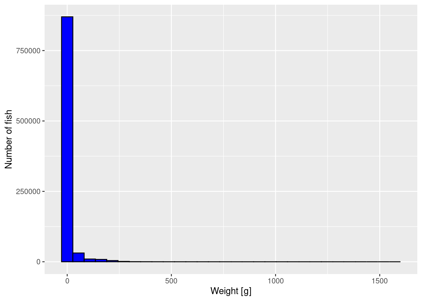
NoteExpand for R details
We have used the ggplot2 package, included in the tidyverse package, to make the plot. It is much more powerful and convenient than the base plot commands. It implements the “grammar of graphics”. If you are not already using ggplot2 it is worth your time to familiarise yourself with it. However for the purpose of this tutorial, you can simply pick up the syntax from the examples we give.
In the above we first specify with ggplot(size_data) that the graph shall be based on the data frame size_data that we loaded previously. We then add features to the graph with the +.
First geom_histogram() specifies that we want a histogram plot. The argument specifies the variable to be represented. Note how this is wrapped in a call to aes(). Don’t ask why, that is the way the grammar of graphics likes it. The specification of how the variables are tied to the aesthetics of the graph will always be given withing the aes() function.
We then specify that we want the bars in the histogram to be blue (fill = "blue") with a black border (colour = "black"). Such tuning of the appearance is of course totally optional. By the way: one has to admire how the ggplot2 package accepts both colour and color, so that our US friends can use color = "black".
Then we add our own labels to the axes with labs().
We assign the resulting plot to the variable p because that way we can manipulate the plot further below. Because the assignment operator in R does not display any result, we added another line with just the variable name p which will display the plot.
The plot is not very informative. It just tells us that most fish are very small but there is a small number of very large fish. We can not see much detail. We will apply three methods to improve the graph.
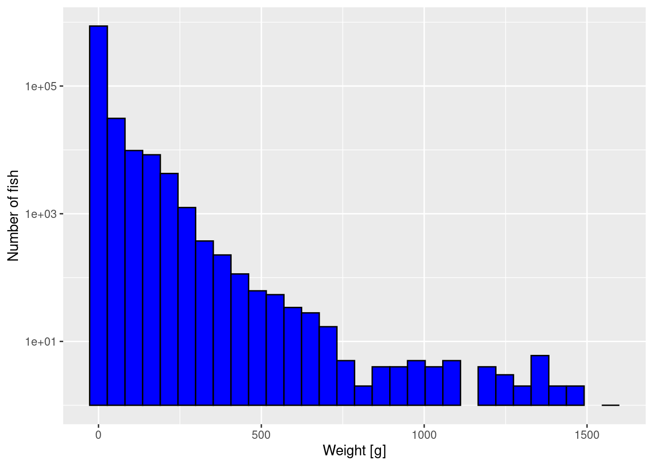
Logarithmic y axis
The first way to improve the plot is to plot the y-axis on a logarithmic scale. That has the effect of stretching out the small values and squashing the large values, revealing more detail.
NoteExpand for R details
We get a warning because there were bins that contained no fish, and taking the log of 0 is not allowed. We can ignore these warnings because the empty bins will simply not be given a bar in the resulting plot.
Unfortunately by default R uses the engineering notation where for example 1e+03 stands for 1000 or 10^3. You can change that by changing scale_y_log10() to scale_y_log10(labels = scales::comma). Try that to see if you prefer it.
Note that the y axis still gives the number of fish, not the logarithm of the number of fish. We have only changed the scale on the axis. We have not changed which variable we are plotting.
Logarithmically sized bins
The second way to deal with the fact that there are so many more small fish than large fish, is to make the bin widths different. At the moment all bins are the same width, but we can make bin widths larger at larger sizes and smaller at smaller sizes. For example we could make the smallest bin go from 1 gram to 2 gram, the next bin to go from 2 gram to 4 gram, and so on, with each next bin twice the size of the previous. This means that for large fish, bins will be very wide and thus more individuals will fall into these bins. So let’s create the break points between these bins:
log_breaks <- seq(from = 0, to = 11, by = 1)
log_breaks
[1] 0 1 2 3 4 5 6 7 8 9 10 11bin_breaks <- 2 ^ log_breaks
bin_breaks [1] 1 2 4 8 16 32 64 128 256 512 1024 2048
NoteExpand for R details
We had decided that we wanted the breaks between the bins to be located at powers of 2. We first create the vector log_breaks with the exponents. The seq() function creates a vector of numbers starting at from and going up to to in steps of size by. You do not need to give the names of the arguments because they can also be identified by their position. So you could also have written seq(0, 11, 1). Such integer sequences are used so often that there is the even shorter notation 0:11 giving the same sequence.
The second line above creates a vector containing the powers of 2 with the exponents we just created in the vector log_breaks. Note how R can perform calculations for all entries of a vector at once, without the need for a loop.
Now we use these logarithmically-spaced bins in the histogram while also keeping the logarithmic y-axis:
p2 <- ggplot(size_data) +
    geom_histogram(aes(weight), fill = "blue", colour = "black",
                   breaks = bin_breaks) +
    labs(x = "Weight [g]",
         y = "Number of fish") +
    scale_y_log10()
p2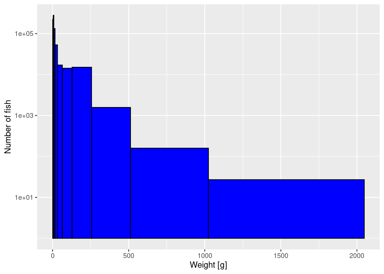
The heights are now slightly more even among the bins, because the largest bin is so wide.
It is very important that you break up your reading of the tutorials with some hands-on work that builds on what you have just learned. Therefore you will find exercises throughout the tutorials. You have now reached the first exercise. You will find that it can be accomplished using the R functions you have already learned about. If you have been running the code from this tutorial in your own R session then you are well set up for doing the exercise.
CautionExercise 1
Now you want to double the number of logarithmically-sized bins used, in order to get a more detailed picture of the size spectrum. So instead of using 11 bins to cover the range from 1g to 2048g, where each bin is twice as large as the previous, you want to use 22 bins to cover the same size range, where each bin is larger than the previous one by a factor of \sqrt{2}.
Create the vector with the breaks between the bins and then use that when you plot the histogram. From this new histogram, please read off the height of the bar at 2kg and compare it to what the earlier histogram in the tutorial showed.
Important
To do the exercise, you can copy and paste code from earlier, but avoid assigning new values to any of the variables that we have already created in this tutorial, because we might use them later on and if you change them you may find it more difficult to reproduce the rest of the tutorial. Simply choose new variable names in your solution. So for example for the vector with the 22 bin breaks, you could introduce a new variable bin_breaks_22 instead of re-using our bin_breaks. And for the plot instead of our p2 you could use any other name, for example histogram_22.
NoteGive me hints
To create the bin breaks you can adapt the code from above, just modifying it so that there are 23 break points for the 22 bins and that they differ by a factor of 2^{1/2} rather than a factor of 2.
Then you can use the earlier code for producing the histogram, only replacing bin_breaks by bin_breaks_22.
NoteShow me the solution
We assume that you have run all the earlier code in the tutorial without problems. Then the following new code will produce the desired plot.
log_breaks_22 <- seq(from = 0, to = 11, by = 1/2)
log_breaks_22
[1] 0.0 0.5 1.0 1.5 2.0 2.5 3.0 3.5 4.0 4.5 5.0 5.5 6.0 6.5 7.0
[16] 7.5 8.0 8.5 9.0 9.5 10.0 10.5 11.0bin_breaks_22 <- 2 ^ log_breaks_22
bin_breaks_22 [1] 1.000000 1.414214 2.000000 2.828427 4.000000 5.656854
[7] 8.000000 11.313708 16.000000 22.627417 32.000000 45.254834
[13] 64.000000 90.509668 128.000000 181.019336 256.000000 362.038672
[19] 512.000000 724.077344 1024.000000 1448.154688 2048.000000histogram_22 <- ggplot(size_data) +
geom_histogram(aes(weight), fill = "blue", colour = "black",
breaks = bin_breaks_22) +
labs(x = "Weight [g]",
y = "Number of fish") +
scale_y_log10()
histogram_22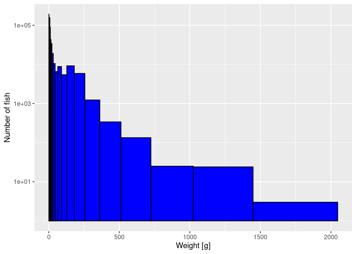
Note
If you compare your new histogram from the exercise with the one in the tutorial above, you will see that not only do you have more bins but also the height of each bar is smaller than previously. So the height of the bars in a histogram depend on our arbitrary choice of the bin width. We will fix that when we switch to plotting densities instead of histograms below.
Logarithmic w axis
The third thing we can do to get a better-looking plot is to also display the weight axis on a logarithmic scale:
p2 + scale_x_log10()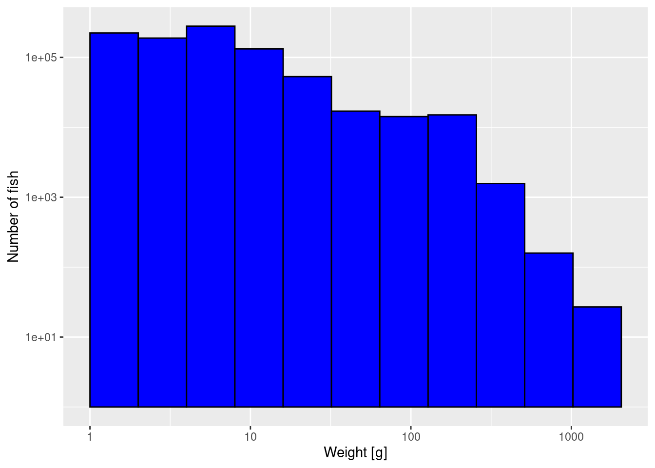
Note how on the logarithmically-scaled x-axis the logarithmically-sized bins all have the same width.
Density in size
We noticed that the height of the bars changed as we changed how we bin the data. That is obvious. If we make a bin twice as large, we expect twice as many fish in that bin. We now want to get rid of this dependence on the choice of the bin width. We can do this if we divide the height of each bar by its width.
This idea is familiar to you in a different context. Assume you want to describe the spatial distribution of individuals. You would then divide your area into small squares and count the number of individuals in each of these squares. Then you divide the number of individuals in each square by the area of that square to obtain the average density of individuals in that square. That is a density in space. The only difference now is that instead of dividing space into squares we have divided the size axis into intervals (which we call bins) and to obtain the average density in size we divide the numbers by the lengths of the intervals.
In fact, thinking of the weight axis in a similar way to how you think about space will generally be helpful when thinking about size-spectrum modelling, especially if you are already familiar with spatially-resolved models.
Because it is important to understand this concept of density in size, we will calculate the number density by hand below, even though ggplot has a built-in function geom_density() that we could use instead. We first bin the data by hand, and then we calculate and plot the densities.
Binning
To understand better what the histogram did and to improve the plots further, we bin the data ourselves. We do this by first adding a bin number to each observation, which indicates in which bin the weight of the fish lies.
NoteExpand for R details
We used the pipe operator |> that simply pipes the output of the code preceeding it into the first argument of the function following it. So the above code is equivalent to
The pipe operator becomes really useful only if you do a longer sequence of operations on data. You will see examples of its use later.
The mutate() function can add new columns to a data frame or modify existing columns. In the above example it adds a new column bin. The entries in that column are here calculated by the function cut that returns the label of the bin into which an observation falls. We specify the bin boundaries with the breaks = bin_breaks to be the boundaries we have calculated above. The right = FALSE means that in case an observation falls exactly on a right bin boundary, it is not included in that bin but instead in the next bin. The labels = FALSE means that the bins are not labelled by the intervals but simply by integer codes.
We then group the data by bin and calculate the number of fish in each bin.
NoteExpand for R details
After we have grouped together all the observations with the same bin number with the group_by(bin), the summarize() function creates a new data frame with one row for each group, which in this case means one row for each bin. That data frame will always have one column specifying the group and then we specified that we want an extra column Number that just counts the number of observations in the group with the n() function. Note that the species is ignored in this calculation.
In the above code you see the pipe operator |> being quite convenient, because it allows us to write the functions in the order in which they are applied, rather than having to write summarize(group_by(...)).
The numbers in each bin give us the heights of the bars in the histogram above.
Number density
The values for Number of course depend on the size of the bins we have chosen. Wider bins will have more fish in them. We now divide these numbers by the bin widths to get the average number density in the bins.
NoteExpand for R details
Here we are using the mutate() function to add four columns to our binned_numbers data frame. bin_start and bin_end hold the start and end point of each bin and bin_width holds its width. Then when we calculate the entries for the Number_density column by dividing the Number column by the bin_width column.
The vector of the start points of the 11 bins is given by the first 11 entries of bin_breaks. We need to exclude the last entry in bin_breaks because that is the end of the last bin and not the start of another bin. this is what bin_breaks[-length(bin_breaks)] does. Note how the - notation allows one to exclude entries from a vector. Similarly we obtain the bin_ends by excluding the first entry of bin_breaks.
Let’s make a plot of the number density against weight. Note that we only calculated the average number density within each bin. When we make our plot we want to plot this average value at the midpoint of the bin on the logarithmic axis. In between these values the plot then interpolates by straight lines to produce a continuous curve.
NoteExpand for R details
You will by now already be able to read this code. The only subtle bit is that to calculate the midpoint on the logarithmic axis we first need to take the log, then the average and then exponentiate again.
Again the graph tells us that most of the individuals are very small, but we can not see any of the details. We therefore plot the density on log-log axes:
p_number_density +
    scale_x_log10() +
    scale_y_log10()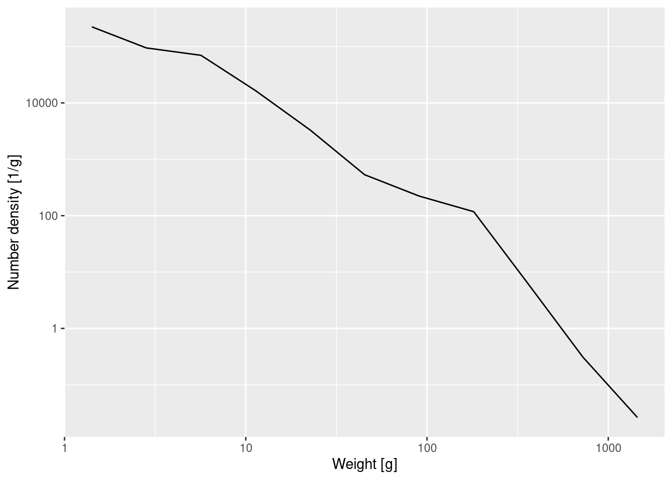
It is time for your second exercise of the course.
CautionExercise 2
Earlier you increased the number of bins from 11 to 22. Because the same number of observed fish was then spread over this larger number of bins, all the bars in the histogram were accordingly less high. By going to the number density we have corrected for this. The density plot created with the 22 bins will of course not look exactly the same as the one created with 11 bins. It will look more ragged because it exposes the noise in the data more.
Create the plot of the number density using the 22 logarithmically sized bins from exercise 1.
CautionGive me hints
First create a new data frame data_with_bins_22 where you assign one of your 22 bins to each observation. You can use the same code as for data_with_bins but using your own bin_breaks_22 vector.
data_with_bins_22 <- 'copy, paste and adopt code from above'Then use that data frame to create a new data frame binned_numbers_22 with similar code as above. Keep the same column names in that new data frame as we used in binned_numbers.
binned_numbers_22 <- 'copy, paste and adopt code from above'You can then use the same code for plotting the graph that we used above, just using your new data frame. If you used the same column names in your data frame then the change you need to make to the plotting code is minimal.
p_number_density_22 <- 'copy, paste and adapt code from above'
CautionShow me the solution
Note how we only needed to change the breaks argument to cut().
In the above we just needed to change the dataset we are using and the bin breaks.
p_number_density_22 <- ggplot(binned_numbers_22) +
    geom_line(aes(x = bin_midpoint, y = Number_density)) +
    labs(x = "Weight [g]", y = "Number density") +
    scale_x_log10() +
    scale_y_log10()
p_number_density_22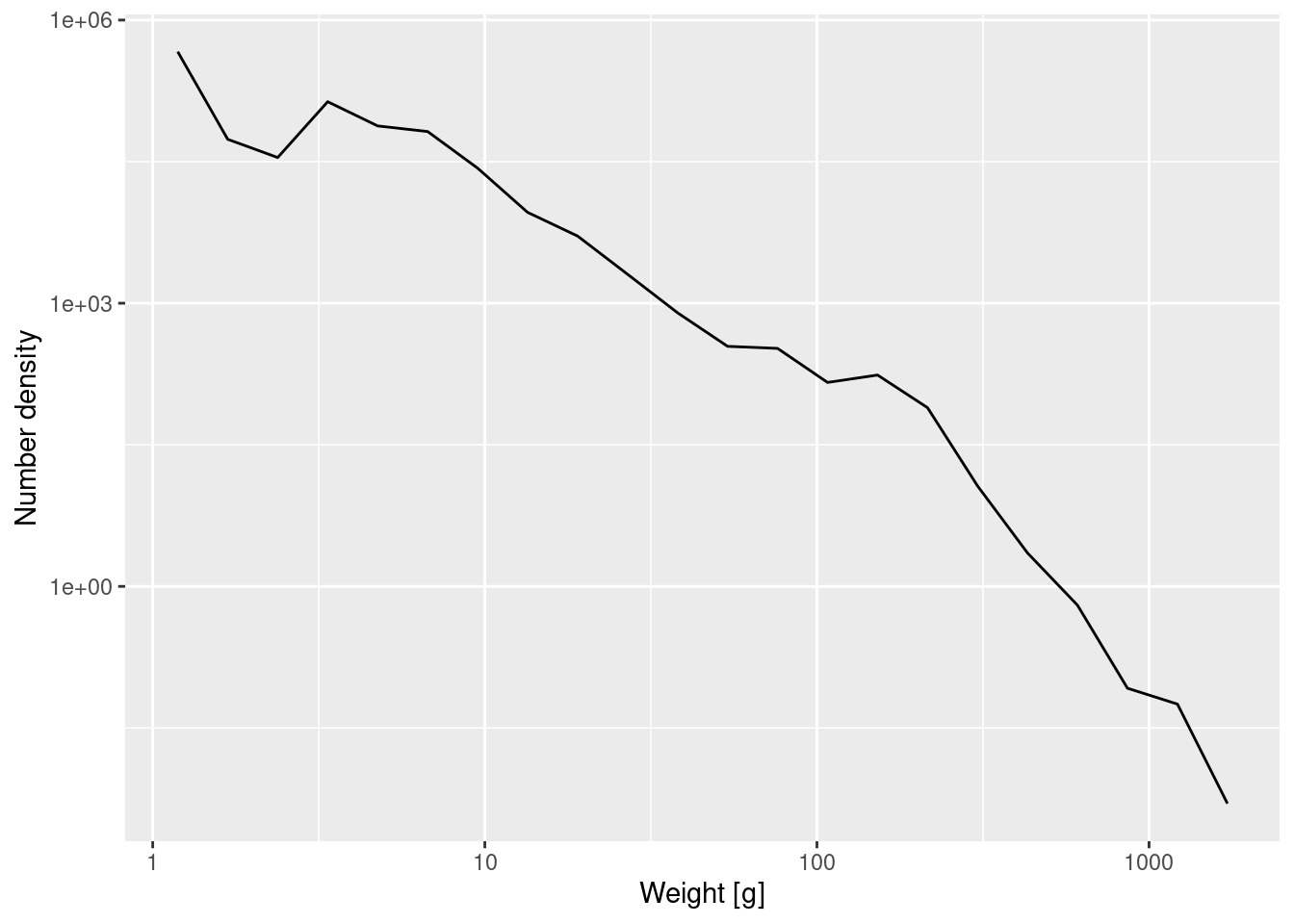
Note how the plotting code is the same except that we specified that it should use our new dataframe binned_numbers_22.
Fitting a power law
The number density in the above log-log plot is described approximately by a straight line. We can approximate the slope and intercept of that straight line by fitting a linear model
Call:
lm(formula = log(Number_density) ~ log(bin_midpoint), data = binned_numbers)

Coefficients:
      (Intercept)  log(bin_midpoint)
           14.563             -2.241
This tells us that the straight-line approximation has a slope of about -2.24. We can also ask ggplot to put this line into the plot, together with its 95% confidence interval:
ggplot(binned_numbers, aes(x = bin_midpoint, y = Number_density)) +
    geom_line() +
    scale_x_log10(name = "Weight [g]") +
    scale_y_log10(name = "Number density [1/g]") +
    geom_smooth(method = 'lm')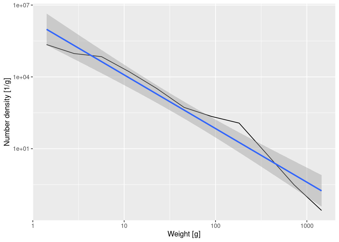
NoteExpand for R details
The linear regression line is produced by geom_smooth(method='lm'). Note how we moved the call to aes() into the call to ggplot(). That is then used automatically for both the geom_line() and the geom_smooth(), so that we did not have to specify the information twice.
We also have put the text for the axis labels into the calls to scale_x_log10() and scale_y_log10() instead of putting it into a separate labs() function as we have done so far. The two are identical. As always in R, there are many different ways to achieve the same outcome.
Important
A straight line on a log-log plot indicates a power-law relationship between the variables with the slope of the line being the exponent in the power law.
If we denote the number density at weight w by N(w), then the above tells us that \log(N(w)) \approx 14.6 -2.24 \log(w).
If we exponentiate both sides to get rid of the logarithms this gives
N(w) \approx \exp(14.6) w^{-2.24} = N(1) w^{-\lambda}
with \lambda \approx 2.24.
The greek letter lambda or \lambda is widely used in size spectrum literature and it denotes the size spectrum slope. A steeper slope (larger \lambda value) means that there are relatively fewer large fish compared to small fish. A more shallow slope (smaller \lambda) indicates a relatively larger number of large fish. Now you know how these slopes are calculated.
Of course the approach we took above of estimating the exponent in the power law from the binned data is not ideal. If one has access to unbinned data, as we have here, one should always use that unbinned data. So the better way to estimate the slope or exponent from our data would be to ask: “If we view our set of observed fish sizes as a random sample from the population described by the power law, for which exponent would our observations be the most likely”. In other words, we should do a maximum likelihood estimation of the exponent. We’ll skip the mathematical details and just tell you the result that the maximum likelihood estimate for the power-law exponent \lambda is
\lambda = 1+\frac{n}{\sum_{i=1}^n\log\frac{w_i}{w_{min}}},
where n is the number of observed fish, w_i is the weight of the ith fish and w_{min} is the weight of the smallest fish. For our data this gives
[1] 1.709584You can see that this approach, which gives equal weight to each observation rather than giving equal weight to each bin, gives a lower value for \lambda, namely \lambda \approx 1.71 instead of \lambda \approx 2.24. This is quite a big difference. But this is still not the end of the story, because we did not take measurement error into account. We assumed that we sampled perfectly. But in reality, small individuals are much easier to miss than large ones, so our data is almost certainly under-reporting the number of small individuals, which leads to a smaller \lambda or more shallow size spectra. Also, in many ecosystems large fish have been removed by fishing, so we might also be missing them. This would lead to steeper slopes and larger \lambda.
Important
The value reported for a community size-spectrum exponent depends strongly on the methodology used to obtain it. You need to be aware of this when comparing exponents from different papers.
Biomass density
Above, we first calculated the number of fish in each weight bin and then divided by the width of each bin to obtain the average number density in each bin. Exactly analogously to that, we can calculate the biomass of all the fish in each weight bin and divide that by the width of each bin to obtain the average biomass density in each bin. So in the code below we will now sum weight and not numbers.
binned_biomass <- data_with_bins |>
    group_by(bin) |>
    summarise(Biomass = sum(weight)) |>
    mutate(bin_start = bin_breaks[-length(bin_breaks)],
           bin_end = bin_breaks[-1],
           bin_width = bin_end - bin_start,
           bin_midpoint = exp((log(bin_start) + log(bin_end)) / 2),
           Biomass_density = Biomass / bin_width)

ggplot(binned_biomass, aes(x = bin_midpoint, y = Biomass_density)) +
    geom_line() +
    scale_x_log10(name = "Weight [g]") +
    scale_y_log10(name = "Biomass density") +
    geom_smooth(method = 'lm')
`geom_smooth()` using formula = 'y ~ x'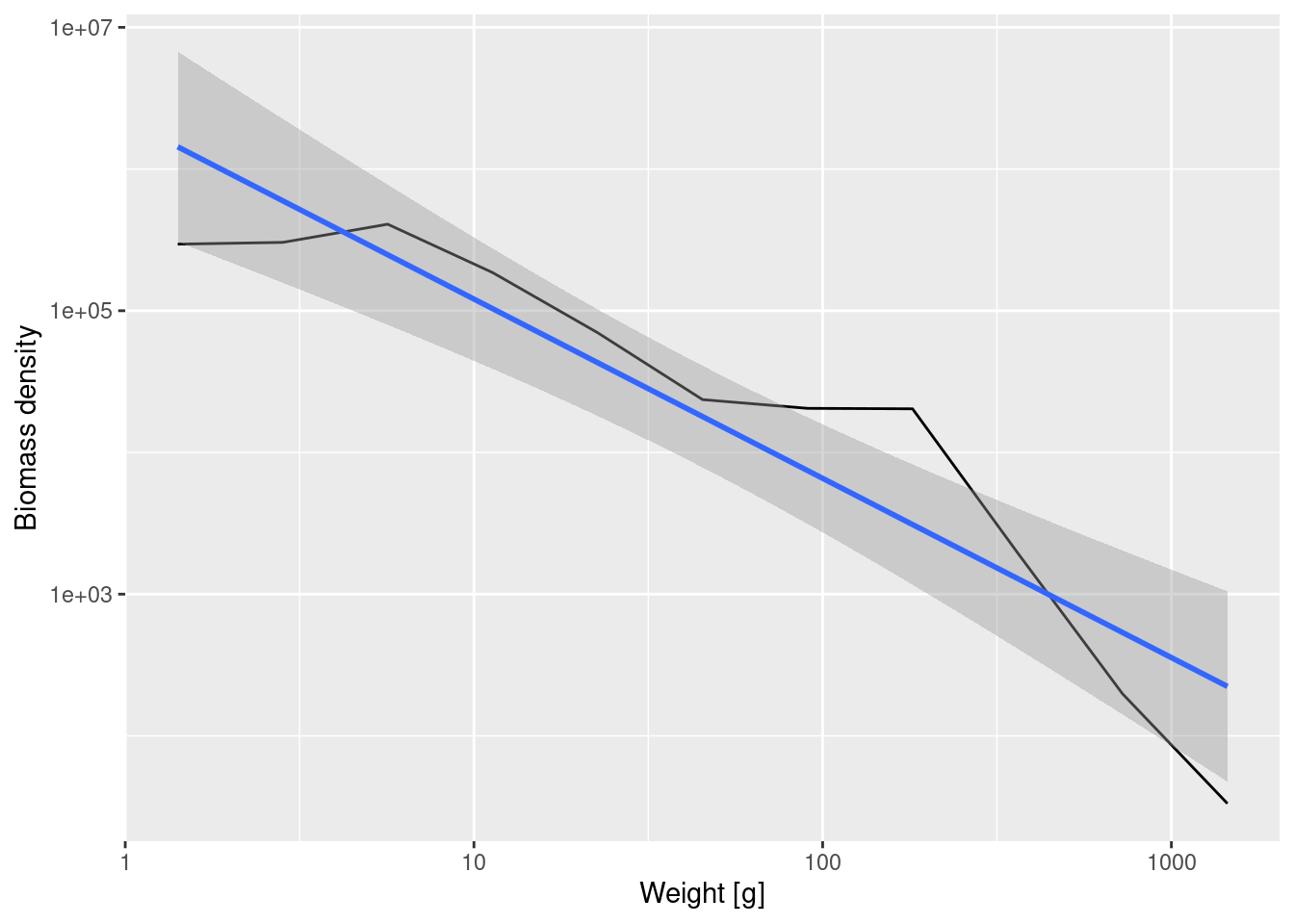
Fitting a linear model to the binned biomass density data now gives
Call:
lm(formula = log(Biomass_density) ~ log(bin_midpoint), data = binned_biomass)

Coefficients:
      (Intercept)  log(bin_midpoint)
           14.615             -1.265
Note that number density and biomass density have very different slopes, because even though there are lots of small fish, each of them contributes little biomass while the fewer large fish each contribute a large biomass. The slope is -1.265 for the biomass density whereas it was -2.24 for the number density.
In formulas, if we denote the biomass density by B(w) then B(w) = w N(w). Therefore if the number density scales with the exponent \lambda as N(w) \propto w^{-\lambda} then the biomass density will scale as B(w)\propto w^{1-\lambda}.
Densities in log weight
So far we found evidence of decreasing biomass densities with size. Yet, the tutorial started with a reference to Sheldon’s observation about equal biomass across sizes. How is this consistent with what we found?
Above, we calculated densities by dividing the total number or total biomass in each bin by the width that the bin has on the linear weight (w) axis. Instead, we could divide by the width of the bin on the logarithmic weight axis.
If we divide the number of fish in each bin by the width of the size bin in log weight we get what we denote as the number density in log weight. Similarly if we divide the biomass in each bin by the width of the size bin on a logarithmic axis we get the biomass density in log weight, which is the Sheldon density.
Let us create a new data frame that contains all these densities:
NoteExpand for R details
The left_join() function combines the columns of the two data frames. The columns listed in the by = argument are those that are common between the two data frames. We end up with a data frame that contains in addition to those common columns also the columns Number, Number_density, Biomass and Biomass_density.
Then we add three further columns: bin_width_log_w holds the width of each bin on the logarithmic axis. This is then used to calculate Number_density_log_w and Biomass_density_log_w. We use the logarithm to base 10 because that is what ggplot2 and mizer like to use. It does not really matter because using a different base would simply multiply the densities by a constant.
We next create a plot that shows all these four densities together.
long_data <- binned_data |>
    pivot_longer(cols = contains("density"),
                 names_to = "Type", values_to = "Density")

ggplot(long_data, aes(x = bin_midpoint, y = Density, colour = Type)) +
    geom_line() +
    scale_x_log10(name = "Weight [g]") +
    scale_y_log10(name = "Density") +
    geom_smooth(method = 'lm', se = FALSE)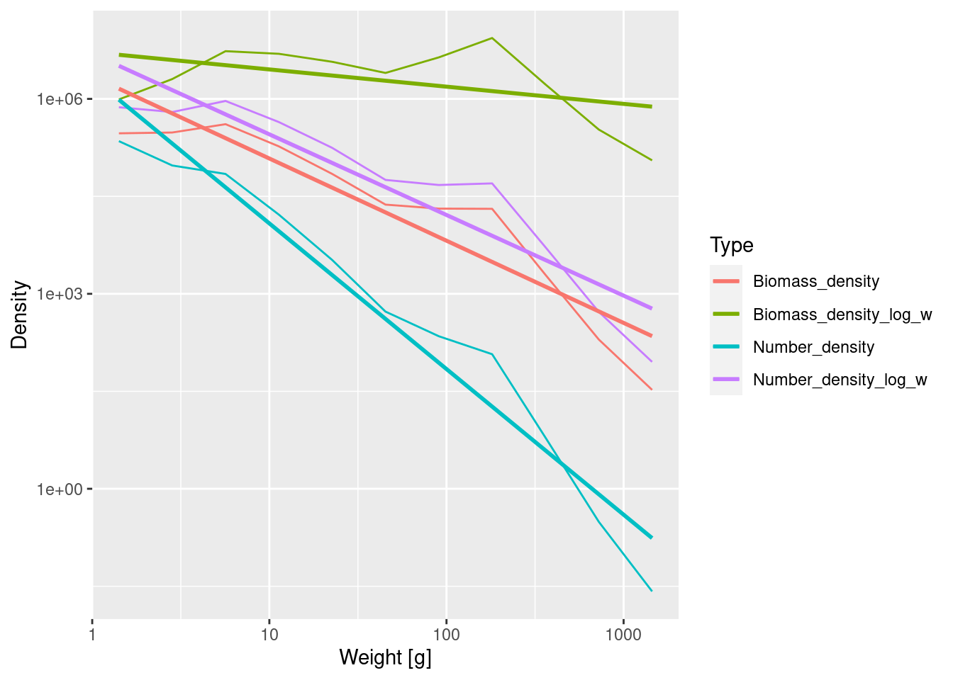
NoteExpand for R details
ggplot() needs the data frame in what is called the ‘long’ format where instead of having one column for each density, all the values for the densities are in a single column and the type of the density is noted in a second column. pivot_longer() effects this transformation. The cols = contain("density") identifies the four columns that hold the densities (because these all contain the string "density" in their name). The other two arguments choose the names for the two new columns.
Simply by including colour = Type in the aes() call we tell ggplot() to plot a separate curve for each type of density, to use a different colour for each curve and to add a legend explaining this.
We added the se = FALSE argument to geom_smooth() to avoid plotting the confidence bands which would have made the plot too confusing.
We see that the number density in log weight has the same slope as the biomass density. The biomass density in log weight has the smallest slope.
The different densities have different units. One should be explicit about units when plotting quantities with different units on the same axis because the height (but not the slope) of the curves depends on the units chosen. The units of the densities we plotted are determined by two factors: 1) Biomass is measured in grams whereas Numbers are dimensionless and 2) bin widths are measured in grams whereas bin widths in log weight are dimensionless. The densities, obtained by dividing either Biomass or Numbers by either bin widths or bin widths in log weight, have the following units:
- N(w) has unit 1/grams,
- B(w) and N_{\log w}(w) are dimensionless,
- B_{\log w}(w) has unit grams.
CautionExercise 3
Use the lm() function to determine the slope of the straight-line fit to the biomass density in log weight in this log-log plot.
CautionGive me hints
We have done something similar in the section on Fitting a power law.
Sheldon’s observation
All the four density curves are alternative ways of representing the size spectrum. We introduce the notation N_{\log w}(w) for the number density in log weight and B_{\log w}(w) for the biomass density in log weight (Sheldon’s density). We have the following relations among the various densities:
B_{\log w}(w) = w\, B(w) \propto w\, N_{\log}(w) = w^2 N(w).
So Sheldon’s observation that B_{\log w}(w) is approximately constant over a large range of sizes w from bacteria to whales can also be stated in terms of the other densities:
- The slope of the number density is approximately -2.
- The slope of the biomass density and the number density in log weight is approximately -1.
- The slope of the biomass density in log weight is approximately 0, i.e., the biomass density in log weight is approximately constant.
Size spectra of individual species
So far we have looked at the community spectrum, where we ignored the species identity of the fish. We will now look at the spectra of the individual species. We’ll plot them all on the same graph and display them with plotly so that you can hover over the resulting graph to see which line corresponds to which species. We also include the community size spectrum in black for comparison. The lines look smoother than earlier because now we use kernel density estimation rather than binning to estimate the densities.
p <- ggplot(size_data) +
    geom_density(aes(weight, stat(count), colour = species), adjust = 4) +
    geom_density(aes(weight, stat(count)), colour = "black", lwd = 1.2, adjust = 4) +
    scale_x_continuous(trans = "log10", name = "Weight [g]") +
    scale_y_continuous(trans = "log10", limits = c(1, NA), name = "Number density in log w")

plotly::ggplotly(p)
NoteExpand for R details
Binning the data is useful but is not the only way to approximate the densities. In reality you don’t need to bin the data by hand or bin it at all. One can also use the kernel density estimation method and ggplot2 even has that built in to its geom_density().
By default, geom_density() would normalise the density so that the integral under the density curve is 1. We use stat(count) to tell it that we want the number density, so that the integral under the curve is the total number, not normalised to 1.
The kernel density method works by placing a small Gaussian (bell curve) at each data point and then adding up all these little Gaussians. The adjust = 4 means that the width of these Gaussians is 4 times wider than geom_density() would choose by default. This leads to a smoother density estimate curve. This plays a similar role as the bin width does in histograms.
Note how easy it was to ask ggplot to draw a separate line for each species. We only had to add the colour = species to geom_density(). ggplot automatically chose some colours for the species and added a legend to the plot.
We have replaced scale_x_log10() by scale_x_continuous(trans = "log10") which does exactly the same thing. But the latter form is more flexible, which we used in scale_y_continuous(trans = "log10", limits = c(1, NA)) to also specify limits for the y axis. We chose to plot densities above 1 only because at smaller values there is only noise. We did not want to set an upper limit, hence the NA.
We then did not display the plot p but instead fed it to plotly::ggplotly(). The ggplotly() function takes a plot created with ggplot and converts it into a plot created with plotly. plotly plots are more interactive. We called the ggplotly() function with plotly::ggplotly() because that way we did not need to load the plotly package first, i.e., we did not need to do library(plotly).
There are three messages you should take away from this plot:
- Different species have very different size spectra.
- The estimates of the species size spectra are not very reliable because we do not have very good data.
- The community size spectrum looks more regular than the species size spectra.
We will discuss species size spectra more in the next tutorial, where we will look at them with the help of the mizer model.
Summary and recap
1) It is very useful for fisheries policy to know how many fish of different sizes there are. This is what size spectra show.
2) We can represent size spectra in different ways. One is to bin the data into size classes and plot histograms. The drawback is that the height of the bars in a histogram depend on our choice of bins. A bin from 1 to 2g will have fewer individuals than a bin from 1 to 10g.
3) To avoid the dependence on bin sizes, we use densities, where the total number of individuals or the total biomass of individuals in each bin is divided by the width of the bin. We refer to these as the number density and the biomass density respectively.
3) The number density looks very different from the biomass density. There will be a lot of very small individuals, so the number density at small sizes will be large, but each individual weighs little, so their total biomass will not be large.
5) Community size spectra are approximately power laws. When displayed on log-log axes, they look like straight lines. The slope of the number density is approximately -2, the slope of the biomass density is approximately -1.
6) When we work with a logarithmic weight axis, then it is natural to use densities in log weight, where the numbers of individuals in each bin are divided by the width of the bin on the log axis. We refer to these as the number density in log weight or the biomass density in log weight respectively. The slope of the number density in log weight is approximately -1 and the slope of the biomass density in log weight is approximately 0, i.e., the biomass density in log weight is approximately constant. The latter is called the Sheldon spectrum.
7) The value reported for size-spectrum exponent depends strongly on the methodology used to obtain it. You need to be aware of this when comparing exponents from different papers.
8) Unlike the community spectrum, the individual species size spectra are not approximately power laws and thus do not look like straight lines on log-log axes. The approximate power law only emerges when we add all the species spectra together.